Modern living room lighting color choices
Published on Jul 7, 2026
Walk into most “modern” living rooms and you’ll notice the same problem, the colors technically match, but the space still feels flat or awkward. The real issue usually isn’t the furniture or decor—it’s the palette.
A modern living room color palette isn’t just about picking trendy paint. It’s about building a balanced system of walls, furniture, textures, and accents that work together. For homeowners in the Leawood area seeking to achieve this perfect harmony, professional modern interior design services leawood can be invaluable in crafting a cohesive and stylish living space.
What Defines a Modern Living Room Color Palette
Modern interiors rarely rely on loud colors alone. Instead, they lean on contrast, restraint, and layered neutrals. The goal is clarity and balance rather than visual chaos.
Unlike traditional decorating, where every element competes for attention, modern color schemes emphasize cohesion. Walls, furniture, textiles, and lighting work together to create a unified visual rhythm. t is often helpful to clarify the nuances between modern vs contemporary interior design to ensure your palette choices align with your intended style.
Key Characteristics of Modern Interior Colors
Most successful modern living room color schemes rely on a structured balance between neutral tones and carefully chosen accents. While this guide focuses on living rooms, the principles of balanced color and design often extend to other key areas of the home, such as those addressed by Kitchen and Bathroom Renovation Leawood.
A common design principle used in modern interiors is the 60‑30‑10 rule. In this approach, around sixty percent of the room is dedicated to the dominant color, usually the walls. Thirty percent is reserved for a secondary color, typically furniture or large textiles like rugs or curtains. The final ten percent becomes the accent color that appears in decorative items such as cushions, artwork, or small accessories. This structure keeps the palette balanced and visually organized.
Neutral Foundations vs Bold Accents
The neutral tones keep the room calm and elegant, while the accent color introduces personality and depth. For those looking to refresh existing elements, services like Cabinet Refinishing and Repainting Leawood offer a cost-effective way to update the feel of your space with a new color scheme.
For instance, a room may feature warm white walls paired with a soft gray sofa. Navy cushions or a deep blue armchair might act as the accent element, while brass lighting fixtures or black metal details add sophistication. The neutral tones keep the room calm and elegant, while the accent color introduces personality and depth. Selecting the right base layers, much like choosing the [Best Materials for a Modern Luxury Home Interior], is critical to anchoring your room’s sophisticated feel.
How Lighting Affects Color Choices
Lighting plays a major role in how colors appear in a living room. A paint shade that looks perfect in a showroom can feel completely different once it is applied to a wall at home.
Rooms that face north typically receive cooler light, which can make colors appear slightly muted or bluish. South‑facing rooms tend to receive warmer sunlight, causing colors to appear richer and brighter Because of these variations, it is always important to test paint samples in the room before committing to a full palette. Exterior finishes also play a role in the home’s overall aesthetic and light interaction; for residents in Leawood, professional Stucco Repair & Installation Leawood services can ensure your home’s facade complements your interior color choices.
Balancing Warm and Cool Tones
A successful modern palette usually balances warm and cool tones rather than relying entirely on one temperature. This balance creates visual harmony and prevents the space from feeling too sterile or overly cozy.
For example, cool gray walls might be paired with warm wooden furniture. A navy accent chair could be balanced with brass lighting or beige textiles. This combination of temperatures adds subtle complexity and keeps the room visually engaging.
10 Best Color Palettes for a Modern Living Room
The most effective modern palettes combine simplicity with intentional contrast. Instead of using many unrelated colors, designers typically build the room around two or three core tones and then introduce subtle accents.
White, Gray, and Natural Wood
This palette is strongly associated with Scandinavian interior design and remains one of the most reliable choices for a modern living room. Warm white walls provide a bright and open backdrop, while a light gray sofa introduces softness without darkening the space. Natural wood furniture such as oak or walnut coffee tables adds warmth and texture.
The combination of these colors feels clean, airy, and timeless. Because it is neutral, it also allows decorative elements like artwork, plants, or textured rugs to become visual highlights.
Beige, Cream, and Soft Brown
Warm neutral palettes have become extremely popular in recent years. Instead of the cool grays that dominated the previous decade, designers now favor softer tones like cream, beige, and light brown. A living room using this palette might feature cream walls paired with a beige sofa and soft brown wooden furniture. Linen curtains and woven textures enhance the natural warmth of the space. The result is a calm and sophisticated environment that feels both modern and welcoming.
Black, White, and Gold Accents
For homeowners who want a stronger visual statement, a black‑and‑white palette with metallic accents can create striking contrast. White walls maintain brightness while black shelving, frames, or furniture pieces provide bold definition. Gold or brass lighting fixtures introduce warmth and elegance.
The key to making this palette work is moderation. Too much black can make a room feel heavy, while too much gold can appear flashy. Balanced correctly, the combination looks sleek and contemporary.
Sage Green and Warm Neutrals
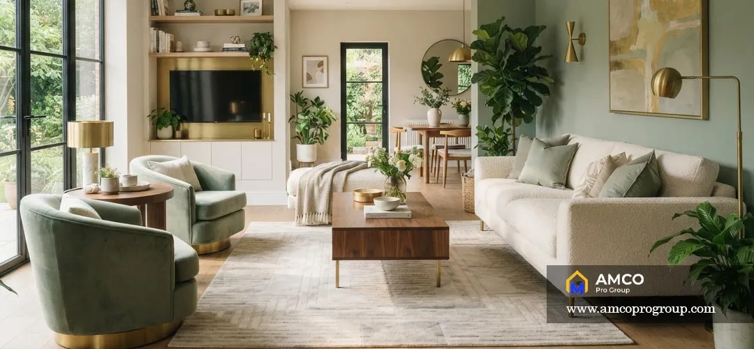
Sage green has become one of the most versatile colors in modern interior design. It behaves almost like a neutral while still adding personality to the room. A living room might combine warm white walls with a sage green accent chair or even a soft green feature wall. Beige or linen upholstery keeps the palette grounded. The gentle green tone pairs beautifully with light wood furniture, stone surfaces, and matte black fixtures.
Navy Blue and Crisp White
Navy provides a deeper, more dramatic contrast than most modern accent colors. When paired with crisp white walls, it creates a bold yet elegant atmosphere. A navy sofa or accent wall often anchors the room, while lighter elements such as wood flooring, neutral rugs, and minimal decor prevent the space from feeling too dark. This palette works especially well in living rooms that receive plenty of natural light.
Terracotta and Cream
Earth tones have made a strong return in contemporary interiors. Terracotta accents bring warmth and personality to a living room without overwhelming the design. A typical arrangement might include cream walls, terracotta cushions or artwork, and walnut furniture. These colors evoke natural landscapes and pair beautifully with organic materials such as clay pottery, woven baskets, and textured fabrics.
Charcoal Gray and Mustard Yellow
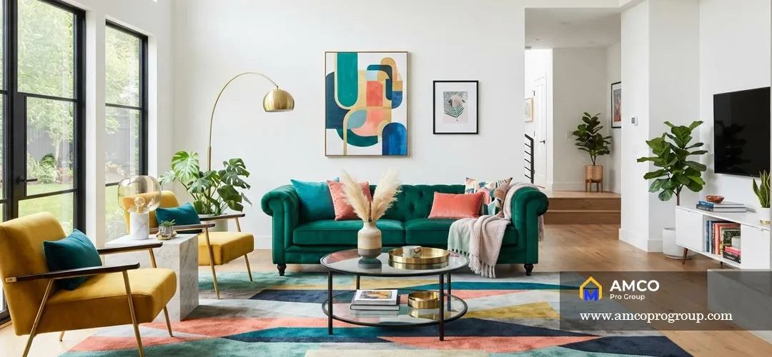
Charcoal gray provides a sophisticated base for a slightly bolder palette. When paired with mustard yellow accents, the contrast becomes energetic yet still refined. In many modern homes, charcoal appears in the sofa or feature wall, while mustard accents appear in an armchair, throw pillows, or artwork. The result is a living room that feels stylish and dynamic without becoming chaotic.
Soft Pastels and Light Gray
Soft pastel colors can work surprisingly well in modern interiors when used carefully. Pale blue, blush pink, or muted lavender accents combined with light gray walls create a calm and airy atmosphere. This palette works especially well in smaller apartments because the light tones reflect natural light and keep the room feeling open.
Earth Tones with Olive Green
Earth tone palettes emphasize natural colors found in landscapes. Beige walls, olive green textiles, and clay‑colored decor pieces create a grounded and relaxing environment. Texture plays an important role here. Linen fabrics, wool rugs, ceramic vases, and wooden furniture all contribute to the layered richness of the room.
Monochrome Gray Palette
A monochrome palette uses different shades of the same color to create depth. In a gray living room, light gray walls might be paired with a medium gray sofa and darker charcoal accents. To prevent the space from feeling flat, designers introduce variety through texture. Velvet cushions, woven rugs, matte ceramics, and brushed metal finishes all help bring visual interest to the monochrome scheme.
How to Choose the Right Color Palette for Your Living Room
Choosing a color palette for your living room is more than just picking your favorite shade; it’s about balancing light, scale, and mood to create a cohesive space. Whether you’re aiming for a cozy sanctuary or a high-end modern aesthetic, this step-by-step guide will help you master the principles of color theory to transform your room with confidence.
Step 1: Evaluate the Room Size and Layout
Small living rooms usually benefit from lighter colors such as warm white, cream, soft beige, or pale gray because these shades reflect more light and make the space feel open. Larger living rooms can handle deeper colors such as navy, charcoal, olive green, or terracotta without feeling visually cramped.
Step 2: Study the Natural Light
Before choosing a final color, observe how the room looks in the morning, afternoon, and evening. North-facing rooms often make colors appear cooler, while south-facing rooms tend to make colors look warmer and brighter.
Step 3: Start with a Neutral Base
Most modern living rooms work best when the largest surfaces—walls, sofas, rugs, or curtains—use a calm neutral base. White, beige, gray, cream, and greige are reliable choices because they create flexibility for furniture and accent colors.
Step 4: Choose One Main Accent Color
After the neutral foundation is set, choose one main accent color. This could be navy blue, sage green, terracotta, mustard yellow, black, or olive green. Use this color in smaller elements such as cushions, artwork, throws, accent chairs, or decorative objects.
Step 5: Balance Warm and Cool Tones
A modern palette feels more complete when warm and cool tones are balanced. For example, cool gray walls can be softened with warm wood furniture, while beige upholstery can be sharpened with black metal details or navy accents.
Step 6: Test Samples Before Committing
Paint and fabric colors can change dramatically depending on lighting. Always test paint swatches, fabric samples, and rug colors inside the actual room before making final decisions.
Popular Modern Color Combinations Designers Love
Professional interior designers frequently rely on color combinations that have proven to work across many different homes and layouts. These combinations appear repeatedly in modern interior design styles because they balance aesthetics with practicality.
Scandinavian-Inspired Neutral Palettes
Scandinavian interiors emphasize brightness and simplicity. White walls, pale wooden furniture, and soft gray textiles create a calm and airy atmosphere. The design focuses on natural light, minimal decoration, and comfortable materials.
Minimalist Monochrome Schemes
Minimalist spaces often rely on monochrome color structures. White walls paired with black furniture create a strong visual framework, while neutral textiles soften the contrast. The emphasis shifts from color to form, texture, and architectural lines.
Mid-Century Modern Color Combinations
Mid‑century interiors use slightly richer tones than minimalist spaces. Mustard yellow, teal, olive green, and warm wood tones frequently appear together. These combinations feel both retro and modern at the same time.
Contemporary Earth Tone Palettes
Earth tone palettes are becoming increasingly dominant in modern homes. Shades such as clay, terracotta, olive, and warm beige create a connection between the interior and the natural environment.
Conclusion
Choosing the best color palette for a modern living room isn’t really about following trends. It’s about creating balance between walls, furniture, textures, and lighting so the entire space feels intentional. For homeowners looking to bring this intentionality to other parts of their home, considering services like Cabinet Refinishing and Repainting Overland Park or expert renovations can be the next step.


